Even more great feedback and now there is a third draft to look at. I think this might be the final one.
Following some great feedback, I have produced the following 2nd draft. The comments I got included:
“…leave out the reference to the HEA PI, unless it suits the purpose of the other conference. The poster should represent your research and I don’t think you need anything which either supports the idea that it is practitioner research or is of a high quality. That should come through the poster…”
“I would put up front and in very big text a summary of the topic and findings (summary instead of introduction). Then around it you put further details on different aspects…” among other pertinent comments. Thank you to all my generous critical readers.
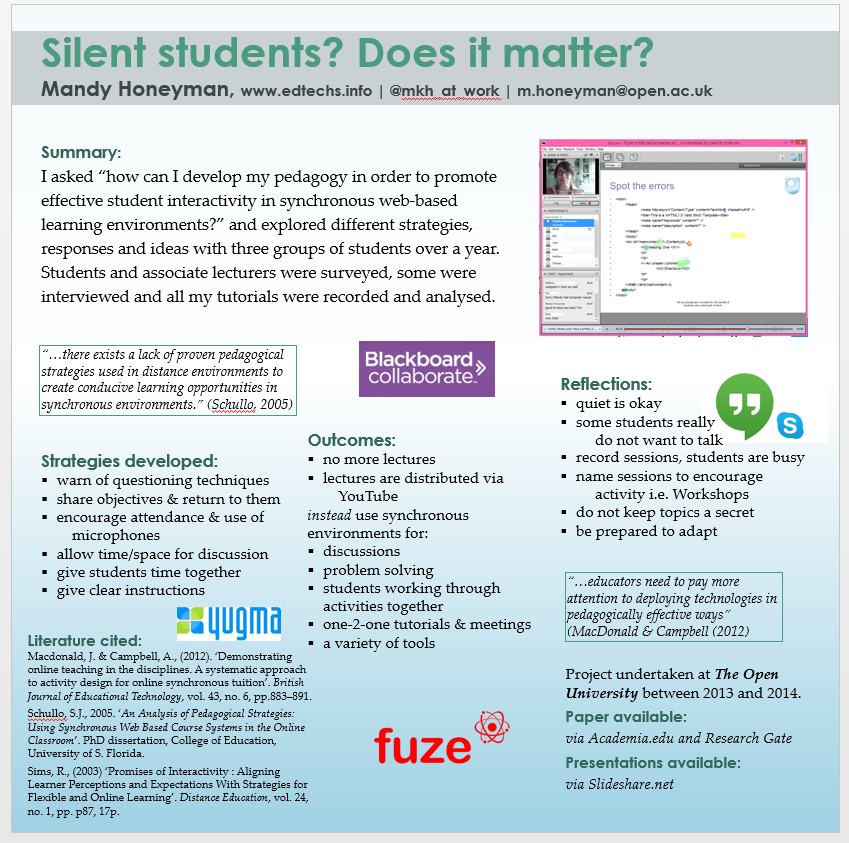
Mandy this looks very much stronger. Potential viewers need to know why it might matter to them, why they should stop and read. As such I wonder if the word ‘Online’ shouldn’t appear boldly? Alternatively, let the Blackboard logo scale up a fraction (though other logos could scale down, ‘fuze’ is occupying a lot of space, given the wide empty margin around it).
Summary of what you did and why is better 🙂 Outcomes could be a little bolder, or possibly just one ‘hook’ outcome, the “quiet is okay” point would be an interesting point to pull out in a quote to catch attention.
Hope this draws them in, this work has important practical points to offer.
Thank you very much Paige, really helpful…. I was dangerously assuming that a conference with people from lots of different universities (and in the US later) people could be using any of these tech (and I deleted one because I didn’t have space for it). I agree about Fuze, so much white space highlights it.