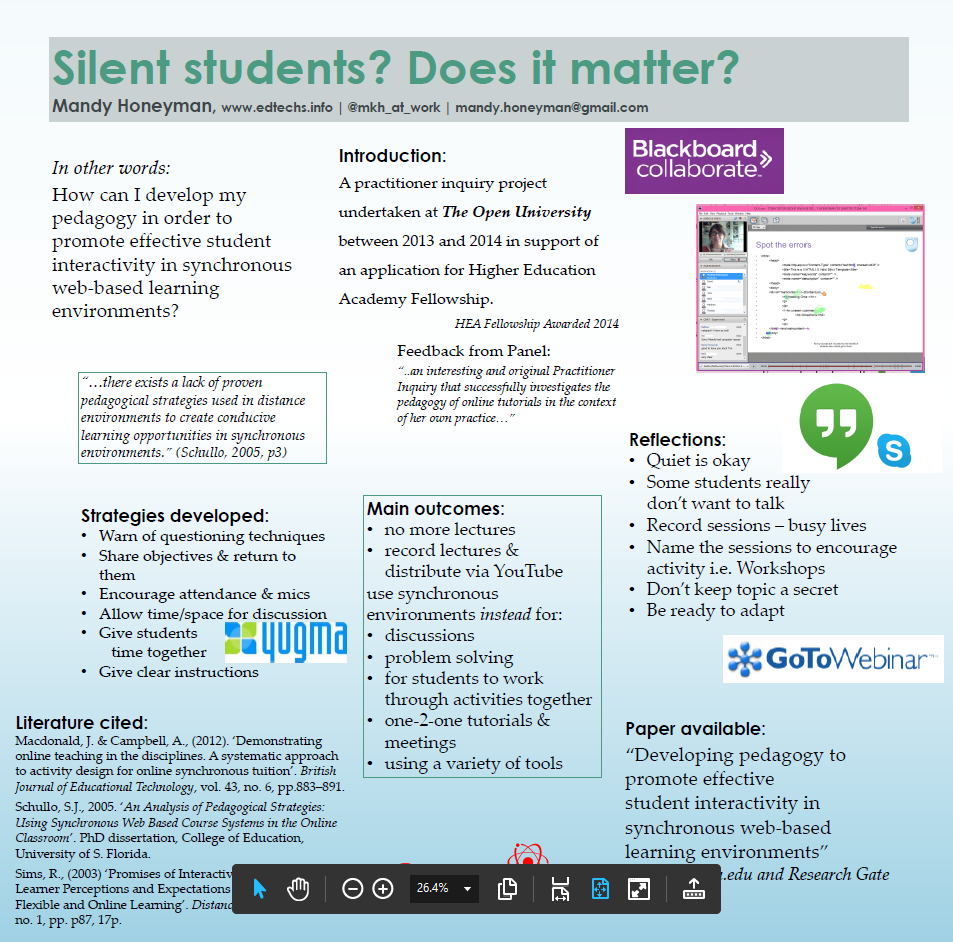
Please see draft two which is replacing this version.
Enhancing Student Learning Through Innovative Scholarship Conference – Durham 16/17 July
This will be A0 size (but 84 cm x 84 cm square) and printed on canvas.
This is my first draft, produced, unusually, in a square format to fit A0 poster stand because I would like to re-use it at another conference – who might use landscape rather than portrait displays.
I would welcome your critique.
The objective for this poster is to have something to talk about.

Hi. The title is great, really gets attention! I also think the content is going in the right direction but maybe needs some formatting revision to help the reader. I would put up front and in very big text a summary of the topic and findings (summary instead of introduction). Then around it you put further details on different aspects, as you are doing, but I would put everything left justified in all columns to help people more easily follow what you are doing (right now the eye tends to jump back and forth because of the different alignment). You might want to have a big visual somewhere that also makes one or a few of your main points. People tend to circulate and “skim” posters and only look up close at those that catch their attention. Hope this is helpful somehow!
Catie’s comments covered key suggestions well. Love the content. There’s an argument in favor of lots of content if posters will be also available online, but large fonts, catchy photo are helpful either way. If you use boxes, add more space between the edges and the content. I’ll send an example of one of mine if I can find the files. Ask Catie to send one of hers too.
Thanks Elaine. I will be posting up draft 3 soon too. 🙂 So I am not sure which version you are trying to look at. I did put a link at the top to try to move on to draft 2 :(.
I have to get better at this blog thing. 🙂