#altc winter conference 2015

All the links from my presentation at #altc, given today

The background story went more like this though….

3.45am huge crashing sound, monsoon rain and howling gale…. really scary…. followed by

3.55am BLACKOUT …. phoned it in (on 1 bar phone access) …. went back to bed…. lay there….

4.35 am decided to drive to Starbucks, could still get there by 5.30am if I moved it…..

5.05 on my way out the door, the leccy flickered back on…..

5.07 and off….

5.20ish and on…..on…. phew… omg… I needed coffee so bad!
pouring coffee
animated coffee (lost attribution, so sorry!)

5.45am (have faffed around with mic for 10 minutes – I h8 windows 8)

6am Gave presentation , lots of people, not a lot of questions.

6.30am phew its over….. another cup of coffee

6.45am some really useful comments on my draft paper (see link above)

Thanks #altc… that was fun!
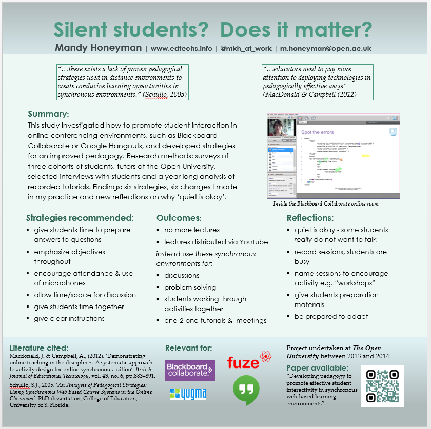
Final poster

I am including this here, because otherwise the process would seem somewhat incomplete. I have used printers (Redcliffe Imaging Limited) I found via Google, who also offer a 30% discount to education users and also to NHS staff. They were incredibly efficient, returning my poster in a day. It has been printed on material so that I can fold it easily and carry it in any bag – not a cheap option but hopefully a sensible onefinal.


3rd (final?) draft of poster for conference


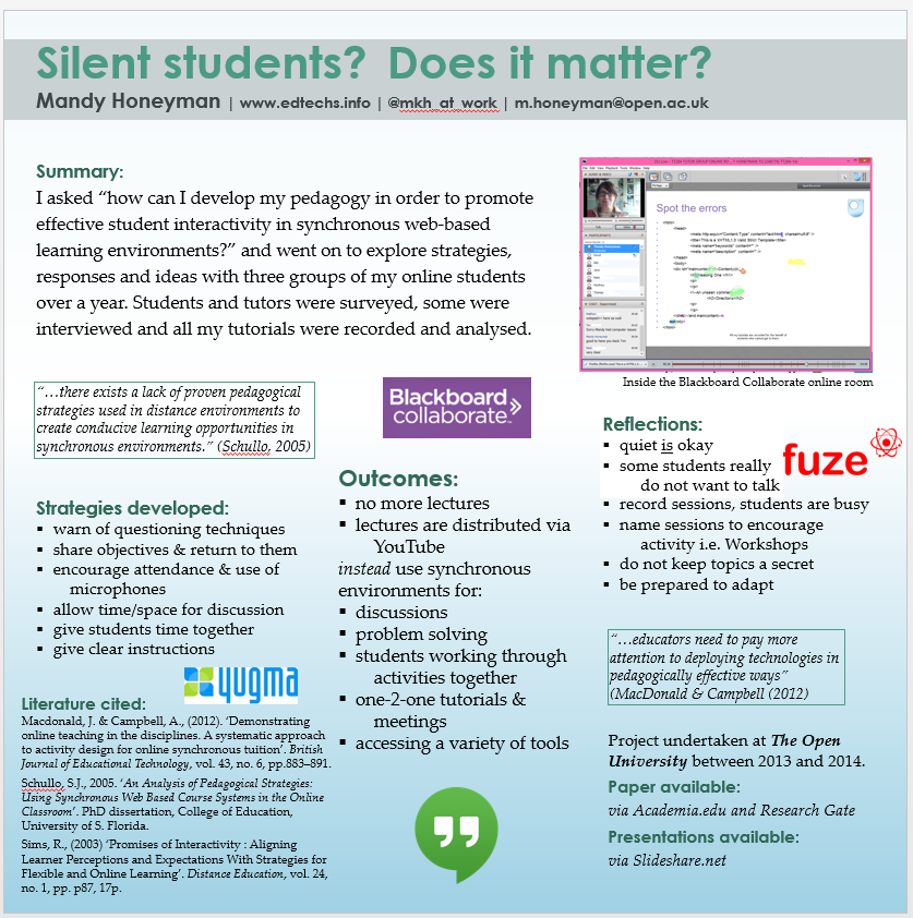
Following some more great feedback: “I wonder if the word ‘Online’ shouldn’t appear boldly? …. ‘fuze’ is occupying a lot of space…. Outcomes could be a little bolder .. the “quiet is okay” point would be an interesting point to pull out in a quote to catch attention.”

I have added the word “online” in a couple of places hoping that would be enough to make a difference.

What do you think?

PosterDraft3

Draft two poster for conference

Even more great feedback and now there is a third draft to look at. I think this might be the final one.

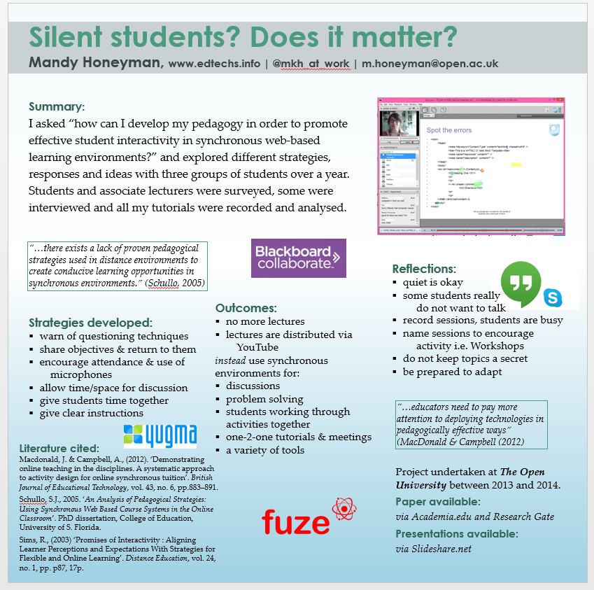
Following some great feedback, I have produced the following 2nd draft. The comments I got included:

“…leave out the reference to the HEA PI, unless it suits the purpose of the other conference. The poster should represent your research and I don’t think you need anything which either supports the idea that it is practitioner research or is of a high quality. That should come through the poster…”

“I would put up front and in very big text a summary of the topic and findings (summary instead of introduction). Then around it you put further details on different aspects…” among other pertinent comments.  Thank you to all my generous critical readers.

draft2Poster


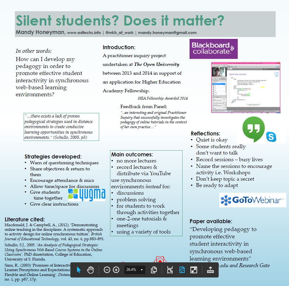
First draft of poster for conference

Please see draft two which is replacing this version.


Enhancing Student Learning Through Innovative Scholarship Conference – Durham 16/17 July

This will be A0 size  (but 84 cm x 84 cm square) and printed on canvas.

This is my first draft, produced, unusually, in a square format to fit A0 poster stand because I would like to re-use it at another conference – who might use landscape rather than portrait displays.

I would welcome your critique.

The objective for this poster is to have something to talk about.

1stDraftPoster


WP to LinkedIn Auto Publish Powered By : XYZScripts.com