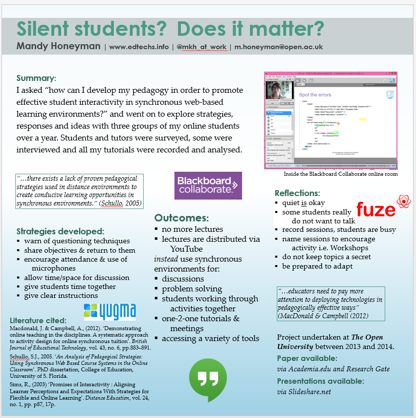
Following some more great feedback: “I wonder if the word ‘Online’ shouldn’t appear boldly? …. ‘fuze’ is occupying a lot of space…. Outcomes could be a little bolder .. the “quiet is okay” point would be an interesting point to pull out in a quote to catch attention.”
I have added the word “online” in a couple of places hoping that would be enough to make a difference.
What do you think?

OK, looking good. Now we are getting to smaller details.
— Consider re-working where you place the icons. Spacing still looks odd, creating doubt about what you are trying to do. It’s especially hard to decipher purpose for “yogma” (?) and “fuze”. Do they compliment the wording in that particular section? They look crowded. And the “yogma” position detracts from the important points you make in the section above. Move 3 or all 4 of the icons to the bottom middle??
— Consider adding a title to the illustration (otherwise known as a “figure”). Whoops. Now I see that there is a “title,” but it could use more emphasis, e.g. italics or a symbol. Question — is the “blackboard collaborate” icon meant to refer to the illustration or is it one more example of an interactive platform?
— Consider revising language for the following:
STRATEGIES (not recommending caps — just formatting this comment)
* replace header with one word to be parallel with the headers for the other 2 lists, e.g. “strategies”
* warn of questioning techniques (I get this, but wording is awkward. How about “highlight questioning techniques used to encourage student participation” or something like that.)
* share objectives and return to them (How about “emphasize objectives throughout the course sessions”.)
OUTCOMES
* lectures are distributed via YouTube (How about “distribute lectures via YouTube” — avoid passive voice. And register 2ond line with text in the first line)
* instead use synchronous environments for (the layout of this phrase, as it follows the YouTube point, needs work — this layout makes it hard to follow the logic. You could inset the subpoints and use a different symbol, for example.)
* students working through and *one-on-one tutorials (register 2ond line with text in first line of each bullet)
REFLECTIONS
* 2ond lines after bullet points (register with text in first line)
* do not keep topics a secret (reword to give a positive suggestion, e.g. “highlight topics throughout”. I actually didn’t know what you meant by this point — perhaps you could clarify).
Hope this helps. Sounds interesting. I would come & talk with you about your experience.
Thanks Elaine, I will give each of these great points more thought….
Hm…. If you’re not tired of receiving comments yet… I’m focusing on the summary bit because it’s what most people will see. In your first version, you had more of a plain text approach, and I think that’s the way to go. I’m afraid you’ll lose people by jumping right in with your formal research question. Three sentences are good: I investigated this, by doing this, and I found this.
i.e. “This study investigated how to promote student interaction in online courses. Research methods included surveys of # students, selected interviews, and year-long analysis of # online courses. Findings: six strategies to improve student interaction, and new reflections on why ‘quiet is okay’.”
Then somewhere else you can put a title that says “research question” and give the formal question, “research methods” and give details on that, etc.
Sorry if this is frustrating because it comes too late in your revision process!!! 🙂
No it’s great, because I have just sat down to work on – hopefully – final. Though I won’t send off to printer until Monday.
Phew, Elaine, thank you so much.I have taken everything on board except for straightening things up into rows and lines. This was a conscious decision — though I am going to ask my extremely talented graphic design neighbour to check this for me, I want to go with that floating eye approach. I have looked at lots of the science posters and personally I find the block approach difficult to look at (at size). I want to look around and settle on something, read it, then look around again and settle on that. I don’t think a poster is a top to bottom, left to right type of reading experience. I could so easily be wrong!
Agree with most of the points made by Elaine.
Still think that the Outcomes bit could do with changing….with regard to that 3rd line. Also, I assume that the Outcomes are what you are recommending or some tips – may be make that clearer?
Thanks for looking at this Reni; I think I have differentiated – the outcomes are direct changes I made, strategies are those recommended by me and others and reflections are mostly from after the study finished and are more fuzzy and up for discussion. In this online world those might be seen as controversial. i.e. quiet students need a different approach to the simple response to constructivism (i.e. getting everyone working together in groups).